|
Welcome to the Get Noticed Branding blog! Today, I’ll delve into a project I recently carried out for a local business. I’ll discuss the client, what they needed, and what I did to bring their brand identity to life. Let’s dive straight in with an overview of the client. The client: Hollyhocks Coffee & Cuisine is a new, high-end coffee shop and restaurant located in the heart of Guisborough, Cleveland Gate Retail Park. Their goal is to serve excellent food and drink in a place locals love to visit, bringing the people of Guisborough together in a warm, luxurious environment. What they asked for: Hollyhocks required a brand identity from scratch, including everything from a logo to a new website, posters, menus, and more. In total, they asked for the following to be designed:
As well as a few other bits and bobs. There was a tight deadline for this one with everything needed in time for their big opening on 3rd December, so I had a real job on my hands. What I did: I got cracking! The first thing I did, like for any start-up business, was focus on the brand identity. This started with a striking logo design to reflect the ethos of the business. The establishment is a high-end place to meet, eat, and drink, and required a colour scheme and set of fonts that matched these values. As you can see, I chose a blue, green, and orange colour scheme with calligraphical style for the name on the logo, and block grey lettering for the supplementary text. This contrast between fonts and colouring matches the modern, luxurious aspects of brief perfectly, and the client was ecstatic with the result. The website design. Next came the website design, with Hollyhocks choosing my starter website design package, which includes:
I crafted the design for each page using the new brand identity as a basis, and as usual, I collaborated with James at Writeo Creative who provided the on-site copy and SEO work. 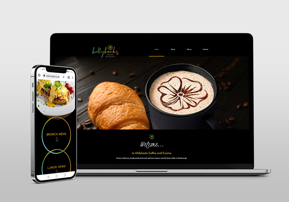 As ever, we turned around the website with time to spare, and the client was very pleased with the result. The website is up and running and as is the case with all websites I design, it’s responsive and packed full of features including mobile optimisation, on and off-site SEO, and more. Take a look at the Hollyhocks website here. Alongside the website, I also created some Instagram and Facebook templates in Canva that allow the client to post their content in the same style each time ensuring brand consistency and professionalism. 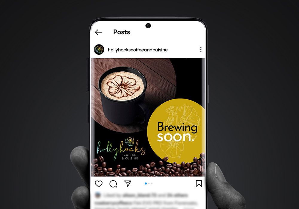 The physical items. Next came the physical promotional materials, which included everything from banners and menus to posters, loyalty cards and stickers. 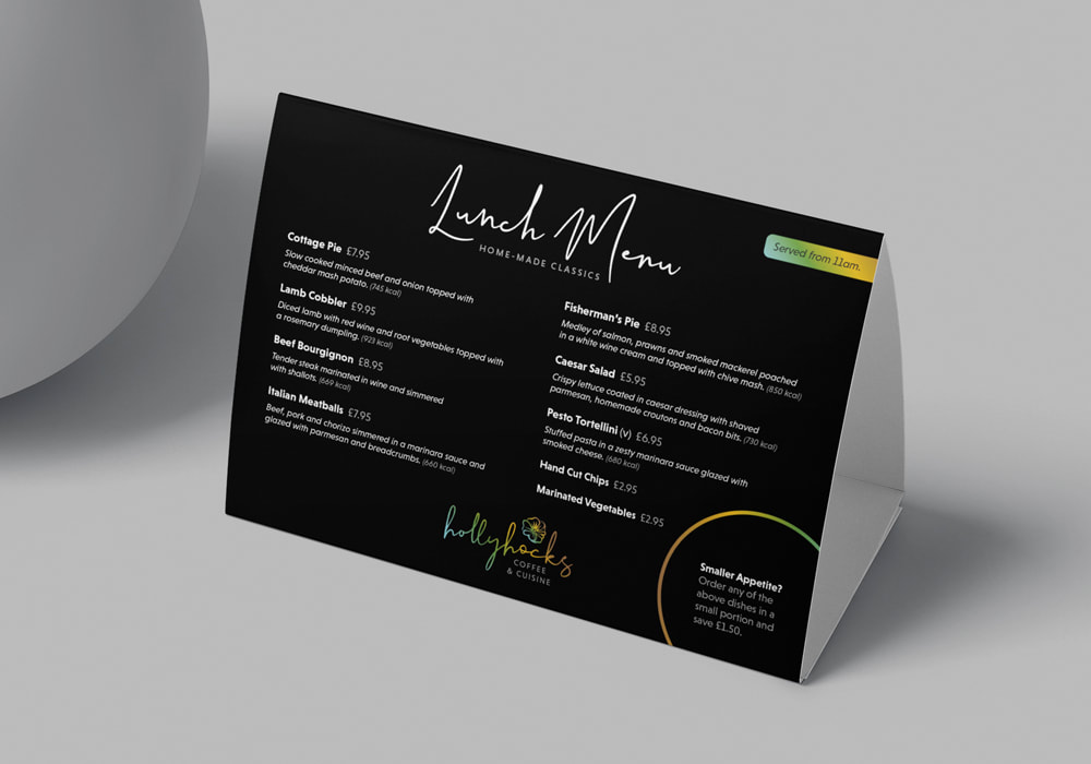 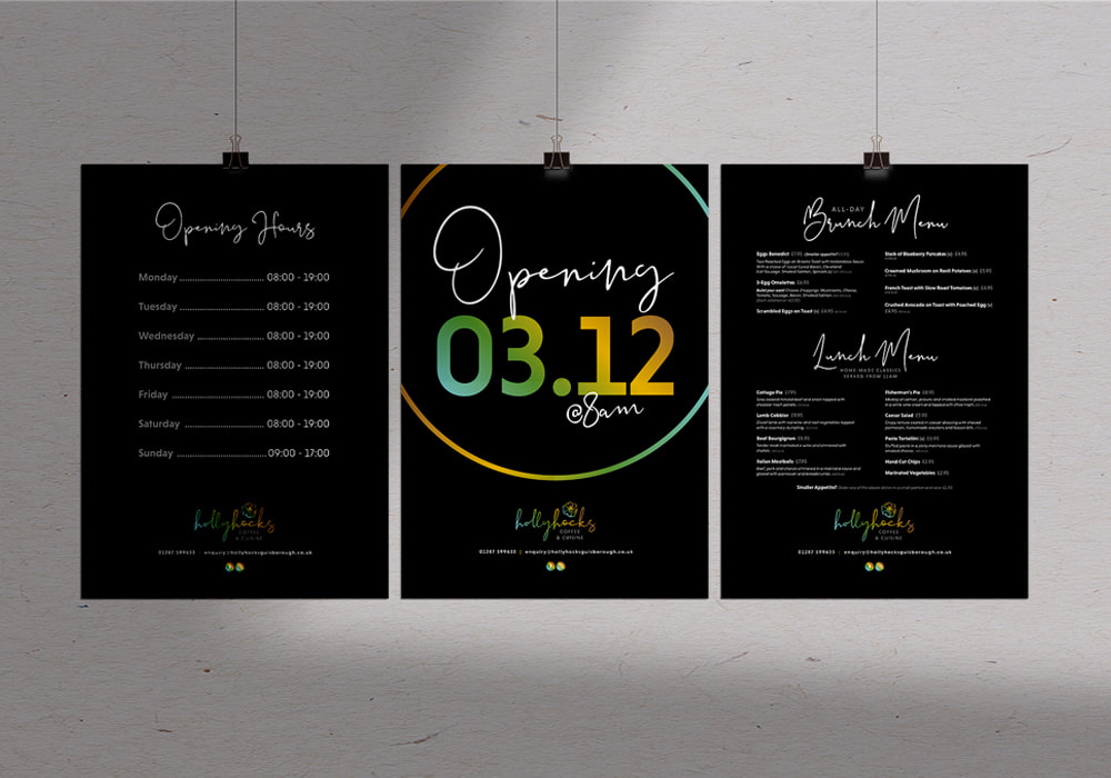 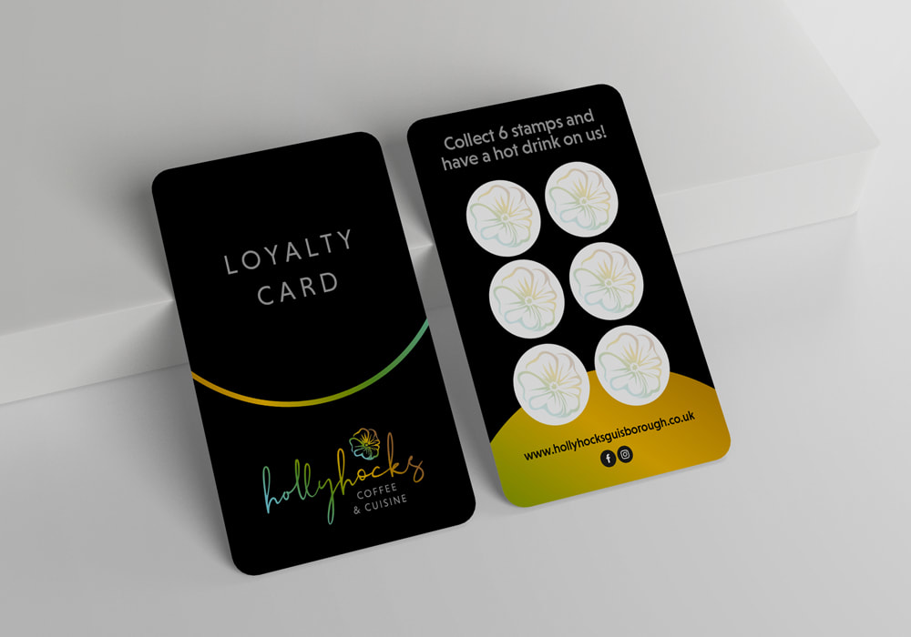 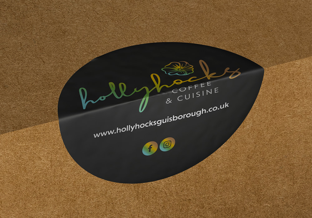 As with all aspects of work I carried out for Hollyhocks, the branding was consistent across all products and easily transferred from item to item. 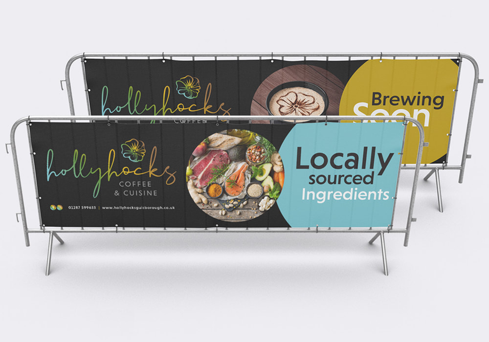 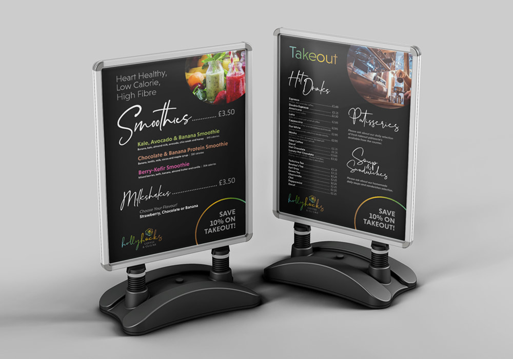 It’s always nice to see things you create in the real world as well as the digital, and this was a great opportunity to showcase my abilities when it comes to design and print work. You can also see how well the branding was applied on each product. This was a key part of the brief as it all needed to be consistent from the website to the physical promotional items. 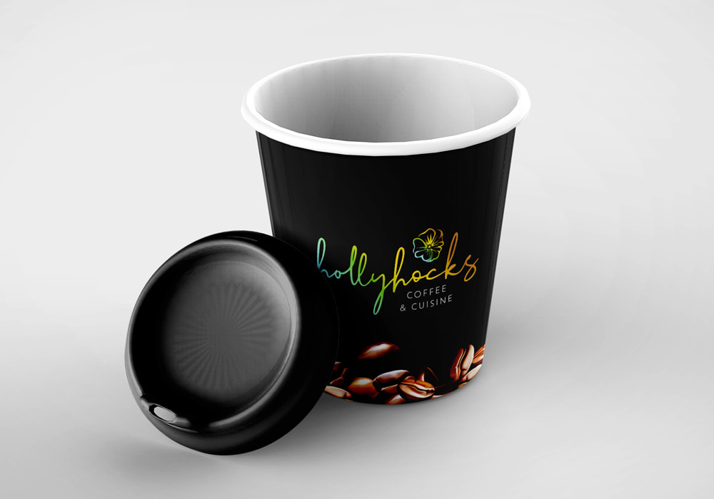 Overall, this was a fantastic project that I thoroughly enjoyed working on.
It was a chance to showcase lots of different aspects of my business, from brand identity design to website design, as well as SEO work and design and print services, and everything came together perfectly. Let’s work together! I have a range of website design packages available for clients of all sizes, and I can help you bring your business to life with a fantastic, super-functional and responsive website design, with all SEO and copywriting work included. Take a look at the Get Noticed Branding website design packages here. Get in touch. From brochures to flyers, posters and large format, even packaging and promotional videos, I’m here to create fantastic branding that gets your brand noticed. I can handle everything you need for a successful brand identity, whether you’re starting from scratch, looking for a refresh, or need bespoke promotional items with quick turnarounds. So what are you waiting for? Get in touch today by emailing [email protected].
1 Comment
I love working with local organisations, so when Darlington Building Society came knocking, I was excited to say the least. What they asked for: A range of editable poster templates for internal staff communications. What I did: I decided to use Canva for this one, so staff with minimal graphic design experience could easily edit and make changes. Created in line with DBS’ strict brand guidelines, each poster hit the mark of the brief, and featured editable elements from QR codes to text, as well as photographs. Take a look at the finished products yourself.... 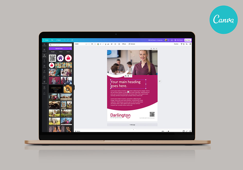 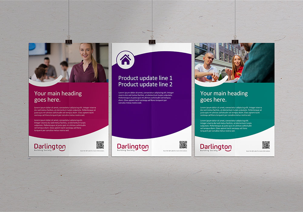 This is a great example of Canva shining, but remember that this is with the steady hand of a professional graphic designer at the helm, and the results of doing it yourself won’t quite be to this standard.
To make the most of my experience and knowledge as a graphic designer, be it logo design, poster design and print, or anything else at all in my vast list of services, get in touch today.  In an increasingly digital landscape, it’s easy to forget how important the real world is when it comes to marketing.
So, I’ve decided to put together a top 5 advantages of posters in your marketing mix... 1. Affordability Much cheaper than digital marketing, TV, or radio, posters are an affordable way of getting your brand out to a massive audience without breaking the bank. 2. Make a local impact For those whose audience is more local than global, a poster is a fantastic way of spreading the word to a huge number of relevant customers. 3. Trust Recent studies have found that physical marketing increases trust in your brand in the eyes of your customers. With all the fake news going around social media and even the legacy news channels, it’s not hard to see why! 4. Emotional response A well-designed poster can influence the buying habits of customers on a subconscious level, arousing empathy and emotion to match the end-goal of your marketing efforts. 5. Flexibility When designing a poster, especially with the help of an expert graphic designer, the possibilities are endless when it comes to design, the message you want to get across, and the audience you want to hit. Get in touch today to see how I can help with your next poster campaign. 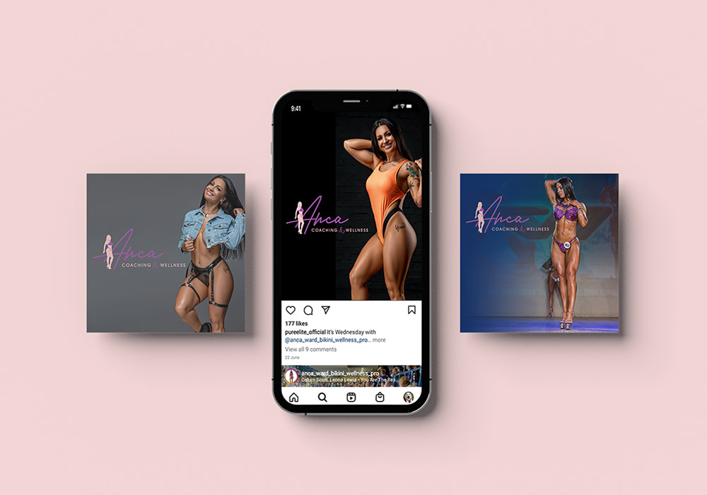 Client: Anca-Nicole Ward is a 6x World Champion Bikini Pro and Wellness Coach, where she uses her knowledge and experience to help others achieve their goals. What they asked for: Due to my experience designing for the fitness industry, Anca naturally approached me when she needed a logo and brand identity designing. Primarily, the logo needed to reflect her professionalism as well as the personable and hands-on approach she uses in her one-to-one sessions. It also had to be versatile enough for all marketing materials, and it needed to appeal to a female audience. It also needed to include Anca’s personal colour scheme. What I did: Adhering to Anca’s specific colour palette preference, I created a versatile logo that hit the brief on all fronts. Combining a hand-traced silhouette of Anca alongside a handwritten typeface to for that personal feel, the final outcome was perfect, and the client couldn’t be happier. 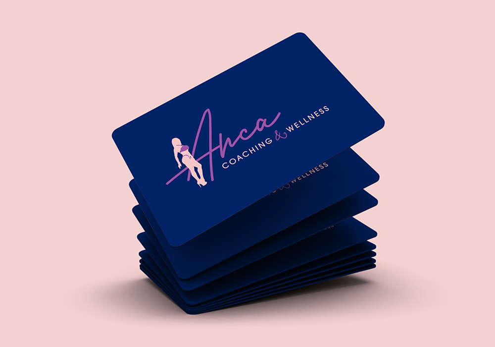 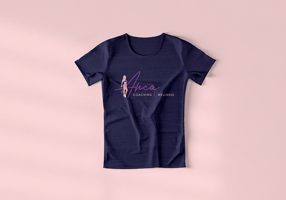  2022 has been a crazy year for the UK, from mind-melting, record-breaking heatwaves to Boris Johnson being out of a job. And those are just in the past month. So, let’s take a break from the insanity with a look at the top 3 graphic design software options, in my opinion. 2. canvaCanva has made massive strides in recent years, and to be fair, it’s a really good software for beginners. It’s available online on your browser, and the drag and drop options and pre-made shapes and templates to play with make it a game-changer. Recently, however, the amount of premium products have increased, making it less cost-effective than it once was. It’s initial major selling point was that it was free, but at this point, it isn’t really the case for most projects. All in all, you can’t ignore Canva, and while it does provide simplicity for beginners, it’s pretty limited in terms of complex design and the amount of free elements available. 1. ADOBE ILLUSTRATORAdobe Illustrator is king of graphic design, and it’s been the industry standard for years due to its powerful range of features.
Not one for the novice, Adobe Illustrator is simply the best graphic design software available, which is probably why it isn’t free like the other two on this list. From drawing to 3D fonts and more, Adobe Illustrator has industry-leading tools that separate it from all competition. You’re also able to segue flows simply with Photoshop and InDesign, and the number of possibilities and features is staggering. That’s why Adobe Illustrator comes out on top, and it’s why I use it myself. To find out how I can bring your brand to life with graphic design using the leading software in the game, get in touch today. 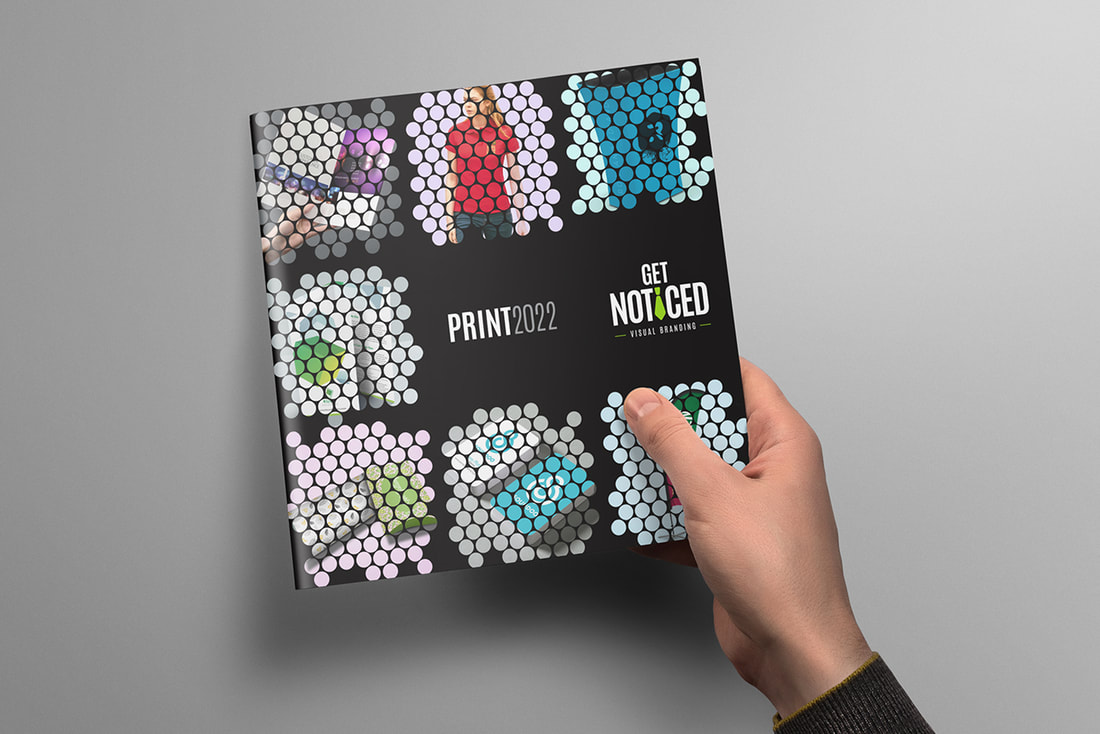
I absolutely love graphic design. It’s as simple as that. It’s my passion, my career, and it’s something I absolutely can’t get enough of. It’s the reason I’ve been in the game for over 20 years and why I’m still going strong to this day. It’s also why I’ve created a brand spanking new Get Noticed Print Catalogue for 2022, which is what this blog is all about. Get Noticed Design and PrintI don’t believe in confining all graphic design to a computer screen. In fact, I love to give my clients a new lease of life in the physical world, and there are untold benefits for your business to do the same. From letterheads to business cards, booklets, brochures, flyers, t-shirts, and more, I provide it all when it comes to the design and print of bespoke items for your business. Let’s take a look at some of the key offerings within the all-new Get Noticed Print 2022 Catalogue. FLYER Design and PrintAs well as for promoting events, flyers are fantastic for product showcases and various other purposes in the business arena. That’s why I provide a range of flyer designs for my clients, with printing to boot. 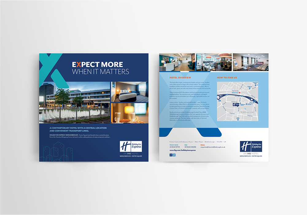 I specialise in creating something special for your brand and helping you get noticed in your industry (hence my business name). The kinds of flyer I provide include, but are not limited to, the following:
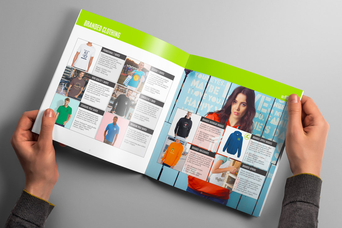
And more! Get in touch to discuss how we can help your business get noticed in a busy marketplace with eye-catching flyer design and print.  Branded ClothingEveryone loves a branded bit of kit. Branded uniforms add a layer of professionalism to your workforce and if you’re running an event, a branded T-shirt or hoody can act as a brilliant piece of promotional material.  There are loads of reasons to get your logo or designs onto clothing, and I offer a massive range of different products to help you achieve this goal. From promotional t-shirts to polo shirts, long sleeve t-shirts and branded overhead hoodies, not to mention zipped hoodies, sweatshirts, and even aprons, I can help with whatever branded clothing requirements you might have. 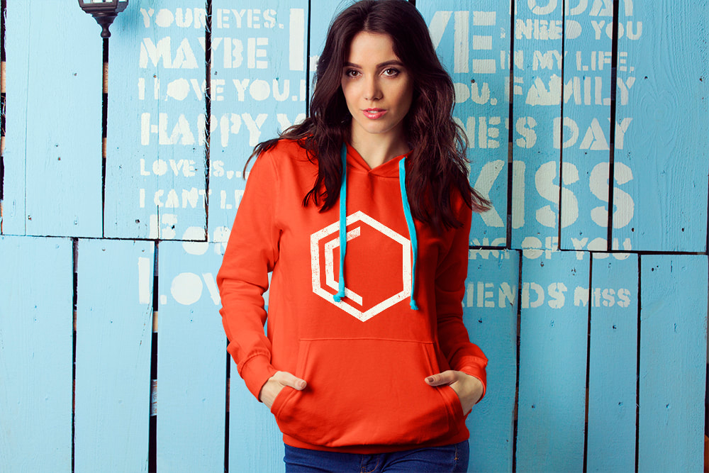 All clothing is great quality and every single item is available in a range of colours and sizes. POSTERS AND RIGID BOARDS DESIGN AND PRINTNothing advertises an event quite like an eye-catching poster! 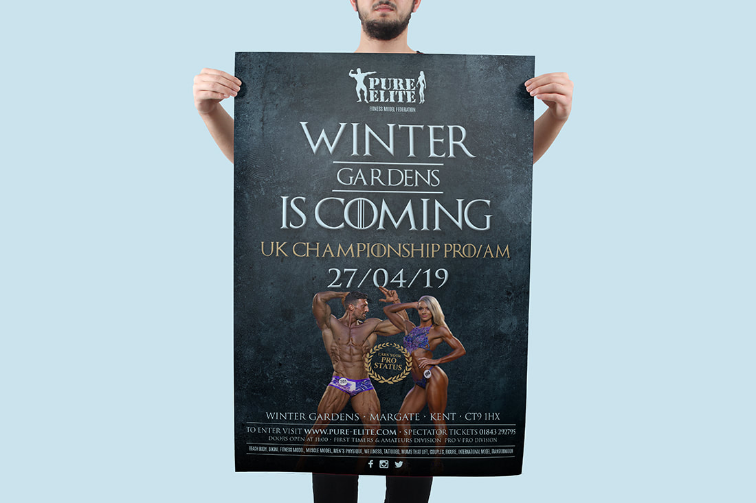 They’re essential for any marketing repertoire because of this, and they’re also quick, easy, and not too expensive to create. At Get Noticed Branding, I have 9 paper types available for your perfect poster across 4 paper sizes, and a choice of single or double-sided print. I offer the following when it comes to posters, and can help with both the design and print of them all:
And more! I can also help with rigid board design and print, with a choice of 6 materials to be used for a range of advertising, campaigning, wall art, and promotional purposes.  These include:
Get in touch to find out all about the posters and rigid board design and print services I provide to my clients. PROMOTIONAL STATIONERYEveryone loves a pen. And if they say they don’t, they’re either lying, or they’re 12 years old.
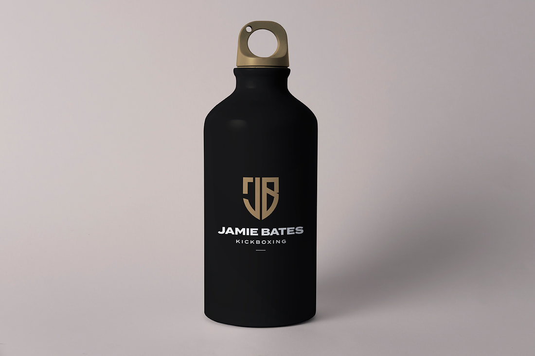
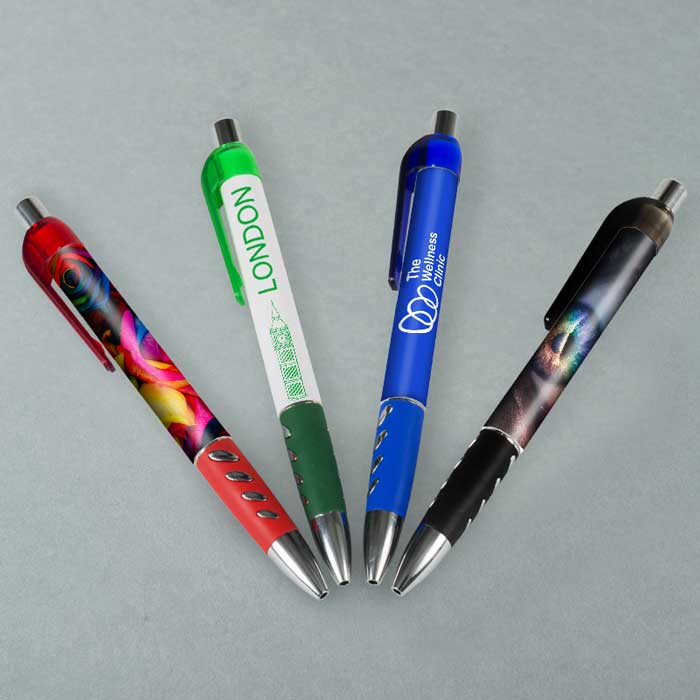
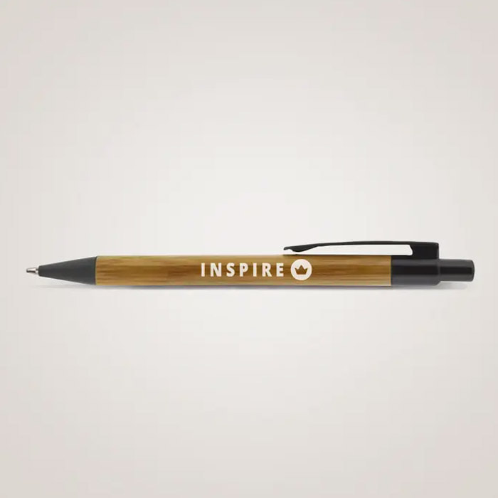
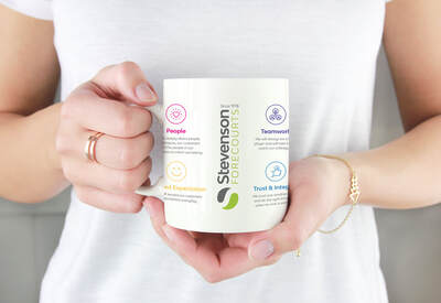
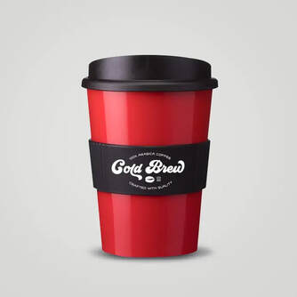
Either way, pens are an incredibly popular promotional product and the perfect way to place your brand in the hands of prospective clients and customers. I offer a huge range of pens, from soft grip to bamboo, cardboard eco pens and recycled, as well as classic twist click and curve varieties. With full design and print available and a range of colours to choose from, you can order between 25 and 10,000 pens for most variations I provide. Get in touch to find out more. BRANDED DRINKWAREA branded mug or cup goes a long way, and I provide a range of options to make any beverage taste that little bit sweeter.
My branded drinkware products include the following, with a range of different colours available and all reusable so your business can help save the environment;
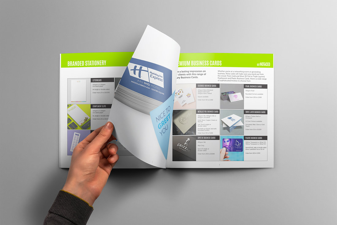
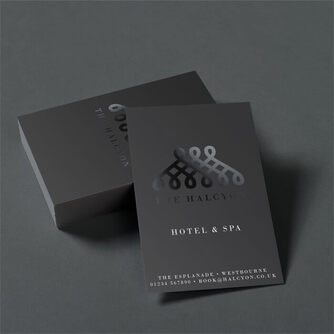
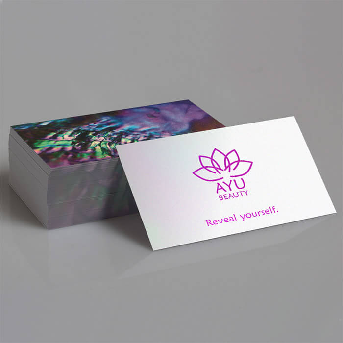
 Get in touch to find out all about branded bottles and cups. Business Card Design and PrintAnd last but certainly not least, we have the beloved business card. 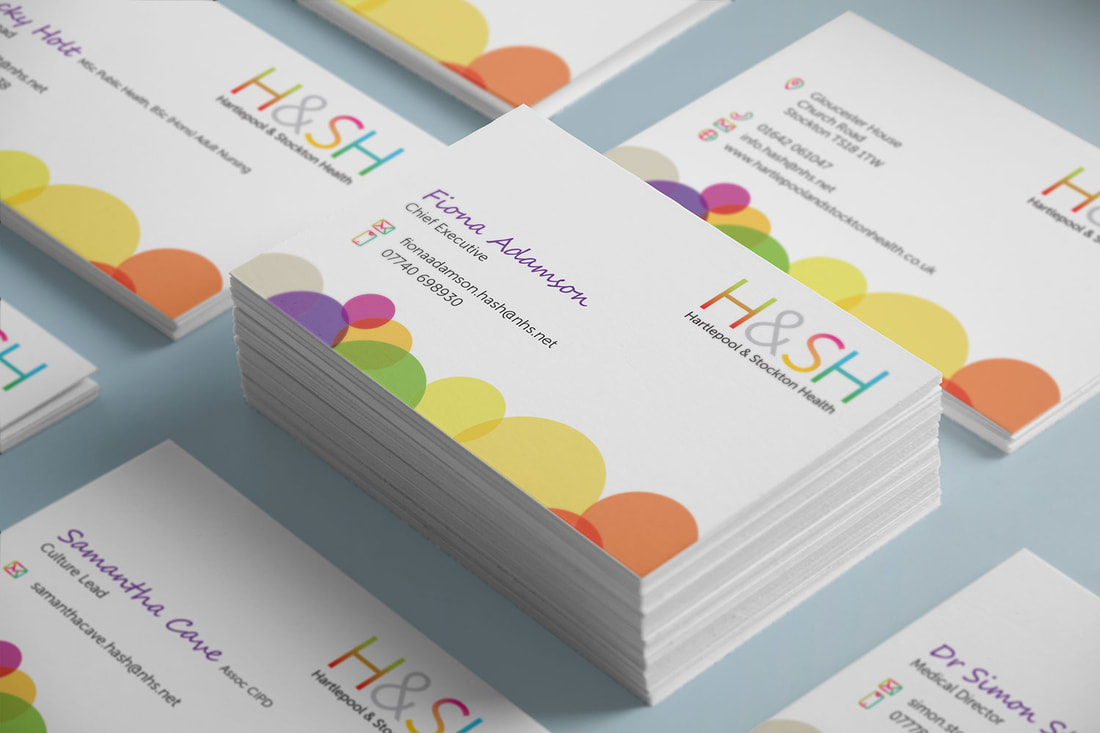 The ideal way to leave a lasting impression with your clients, be it at a network event, meeting, or anywhere else you might find yourself making vital contacts. Show you mean business with the perfect business card, and order from a range of different options with Get Noticed Branding. These include:
Choose between orders of 50 to 10,000 for selected variations, with a variety of colours, textures, and finishes to choose from. Get in TouchTo find out more about the fantastic design and print services I offer, get in touch today.
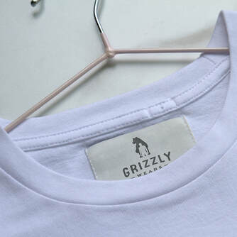
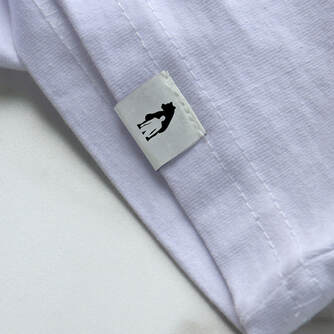
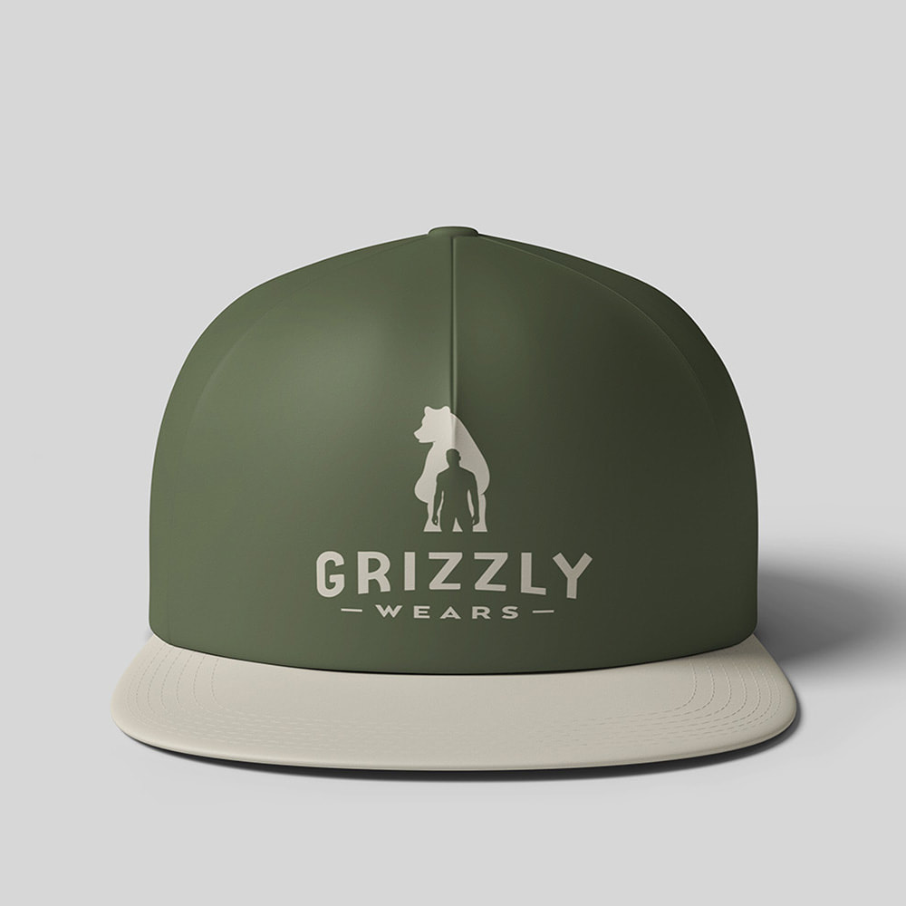
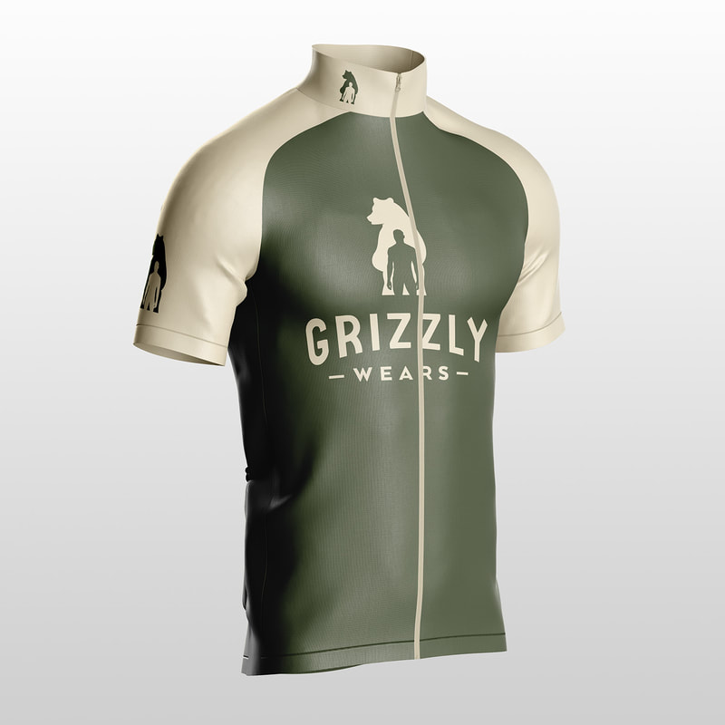
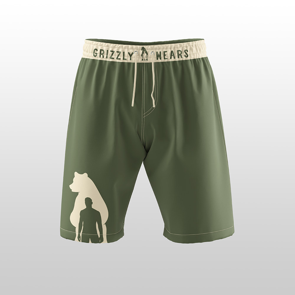
You can also download The 2022 Get Noticed Print Catalogue right here for more information on the full range of products I can help you with. DECEMBERIn this month’s edition of Brand Values, I’ll be helping you get a head start on the January rush. You know the one, where everyone becomes a sportsman to work off all that Christmas merriment! 😅 So, let’s get warmed up with a couple of sports-based case studies and news in the graphic design world, and finish off today’s workout with some Get Noticed Branding deals that promise to give you some extra pennies for Christmas. Case Study - Ezee Aim GolfThe Client: Ezee Aim Golf, a new start-up based in Florida offering the next generation of golf training products, used by players around the world. 🏌🏻♀️ What They Asked For: The client, Kevin Craggs (world-famous golf coach and ex pro no less) reached out in need of a brand identity design for Ezee Aim Golf. He also wanted help with product development, website landing and product pre-order pages, social media graphics and merchandise mock-ups. ⛳👌 What I Did: I got to work and started with the logo which perfectly encapsulated the style and purpose of the brand. Then, I moved onto the merchandise, which came in the form of a cap, golf balls, and two different putting aids. 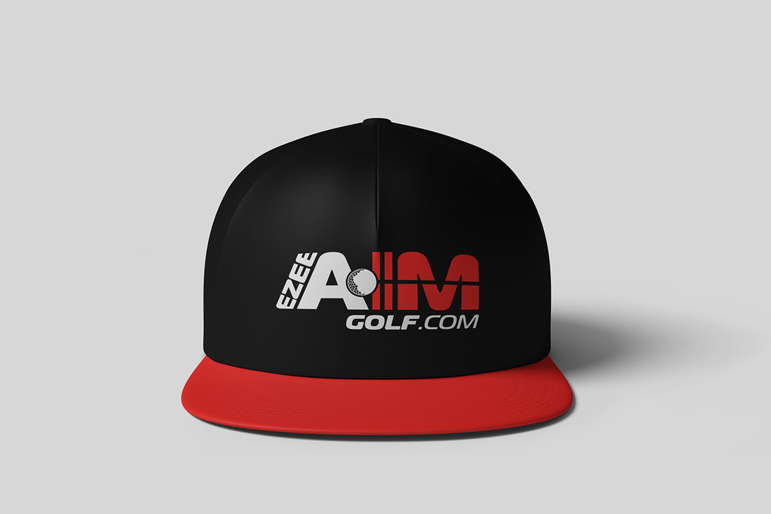 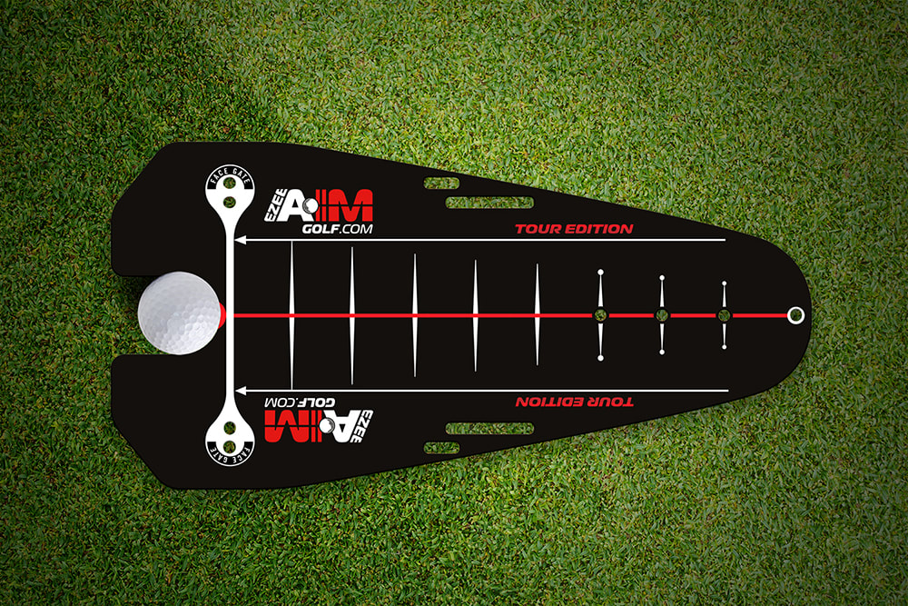 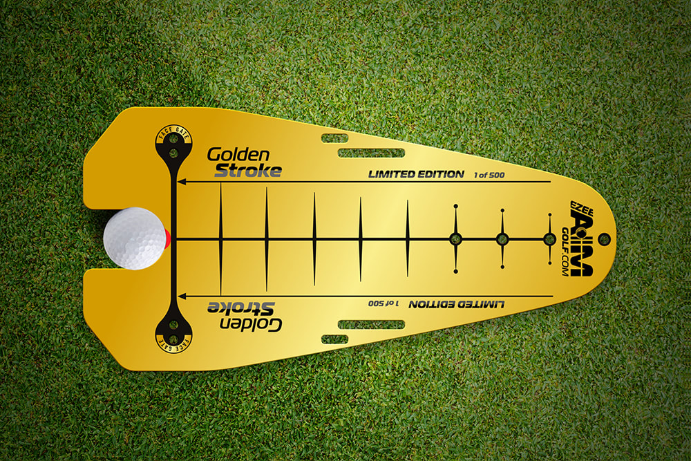 Then it was time for website landing page, pre-order form and social media graphics, which needed to attract attention and look the part on all platforms. 🤳🏻 It’s fair to say that I got a hole in one with this particular project, and the client was extremely happy with the result. (Apologies for the pun, I couldn’t resist). 😂 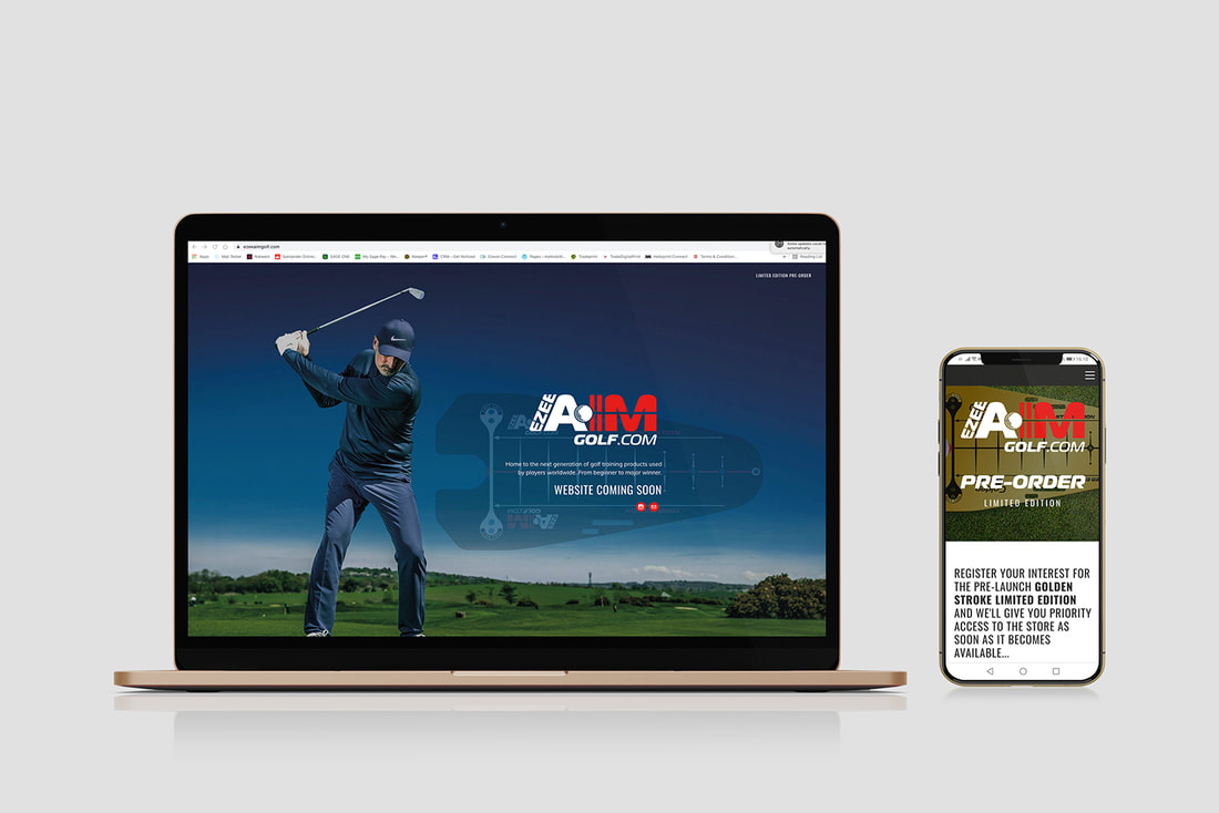 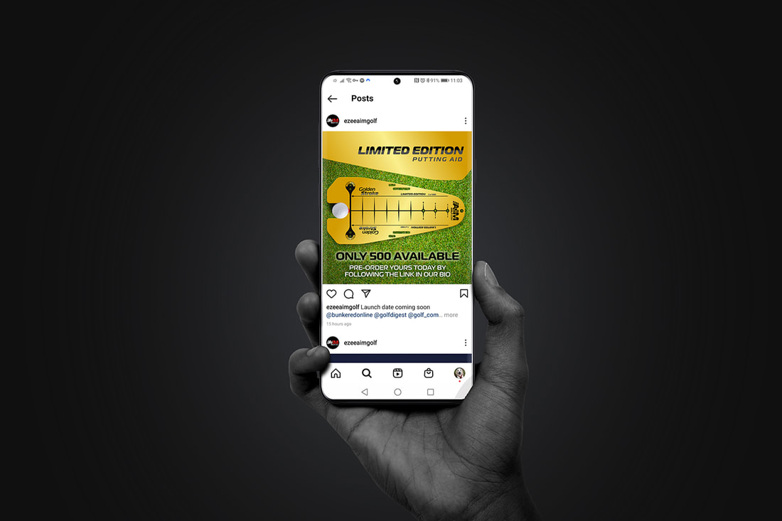 Get Noticed Print Offer - Branded Sports BottlesIt’s thirsty work being such a fantastic designer, and I’m sure the same can be said for your business. 😇 But don’t worry, because I’ve got you covered with a fantastic print offer for these 600ml Vigo bottles, which come with a built-in straw! 🤯 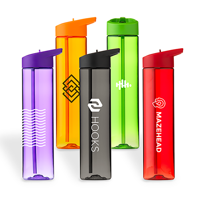 These beauties are high-quality and long-lasting, coming in a BPA free material. They’re also made up of 100% recycled PET materials. Super-durable and even re-usable, you can choose from a range of 10 different colours with Get Noticed Branding. 👌 I can print your logo from 1 to 4 spot colours on your colour of choice, and I’m offering a brilliant offer of 50 bottles for £275 +vat (based on 1 spot colour print, ask for more details if your logo has more than one colour). This is a perfect Christmas gift for clients, or an event giveaway, so get involved today and reply to this email to get booked in. 50 bottles for £275 +vat - only £5.50 each! Graphic Design in The World of SportThere’s been lots of talk in the graphic design world recently about how creatives can ignite change with sports like basketball, football, and rugby. Take rugby, for example, which has historically been a bit of a man’s world. And while things are definitely improving, the pandemic has affected the sport severely, with interest now suddenly waning.  DesignStudio have stepped in and in a bid to help change the world of female rugby, are looking to step away from the male comparisons when it comes to promoting the sport. Take a read all about this in Designweek, and let me know your thoughts. Another Designweek article that caught my eye is all about basketball, and how underfunded it is in the UK. They’ve spoken to a few experts who’ve said that art courts could be a way to boost interest, and it’s something I find really interesting! It’s hard to deny that they can look great, but will they make a difference? Check out the below and read about it for yourself. 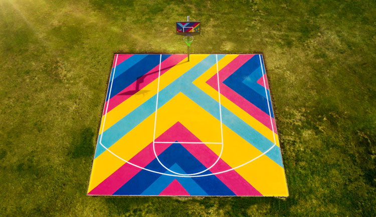 And finally, the nation’s favourite sport – football. Creative Review have asked a simple question, and one that I find intriguing – can design help football reconnect with fans? In this particular article, they take a look at how design and comms teams are shaping the image of the beautiful game. They also examine the ways in which Premier League teams can learn from those in lower leagues when it comes to kits, logos, and more. It’s a fascinating read, and well worth your time. Case Study - Grizzly Wears ClothingBack to another case study, next, and an exciting company by the name of Grizzly Wears. 👊 The Client: Grizzly Wears is a bit closer to home than sunny Florida, in fact, they’re a start-up in my hometown of Guisborough. 😁 They provide a range of ethically sourced outdoor and sportswear from accredited suppliers. All their products are also sustainable, and they push the boundaries by using eco-friendly materials such as bamboo. 🌍 What They Asked For: They came to me in need of a brand identity design in line with their ethos, as well as a label design, and mock-ups for clothing. 🩳 What I Did: I created them a strong logo, utilising a combination of a bear and man silhouette. 🐻 The client was ecstatic with the end result - a logo that encapsulated what the brand is trying to do, and one that’s also versatile and impactful. 👇
Stationery Savings with Get Noticed Branding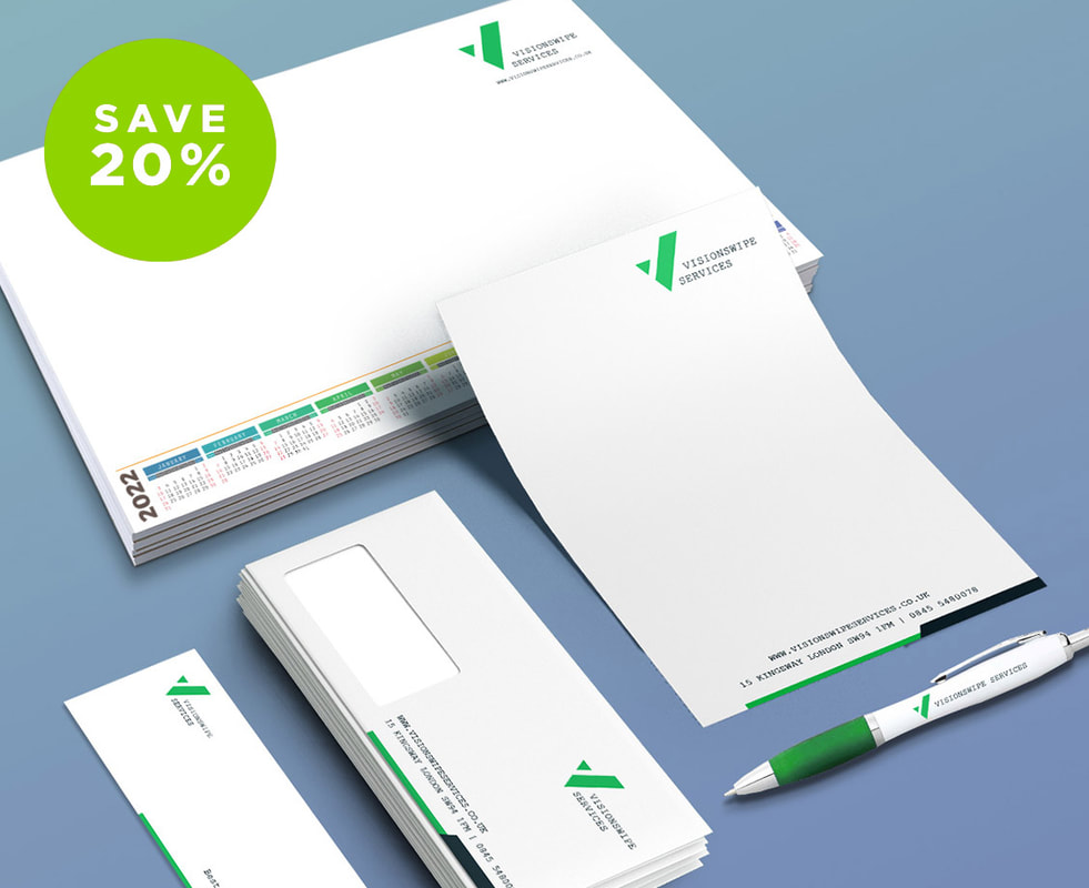 Since stationary is such a necessity for businesses, I’ve pulled a massive saving out of my Santa sack - 20% off selected stationery! 🤯
This deal includes:
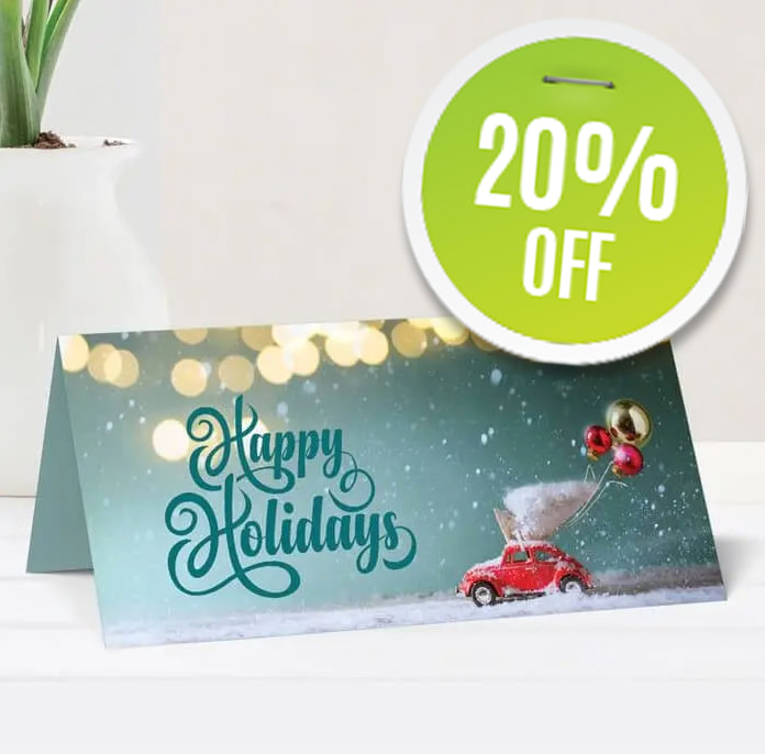
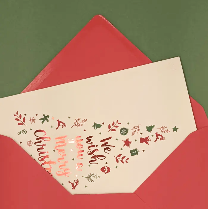
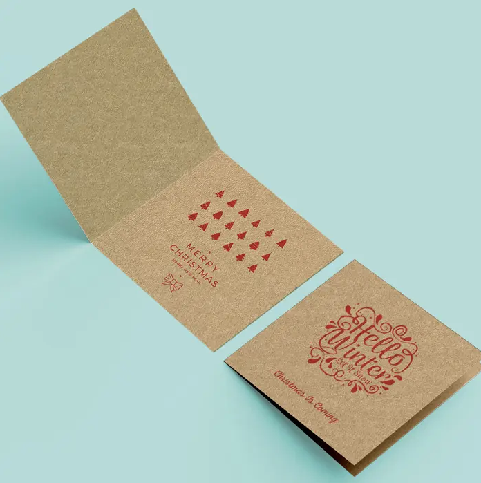
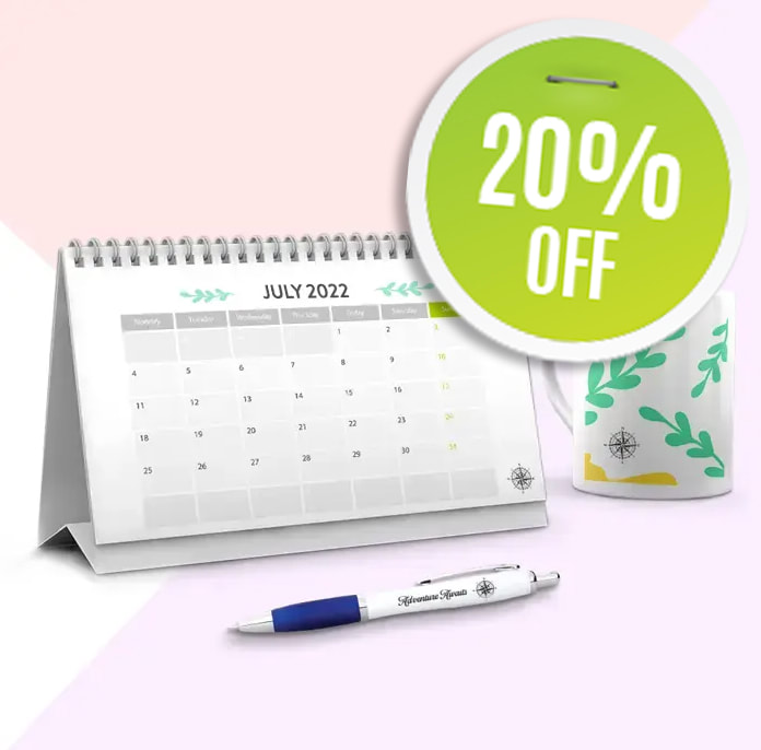
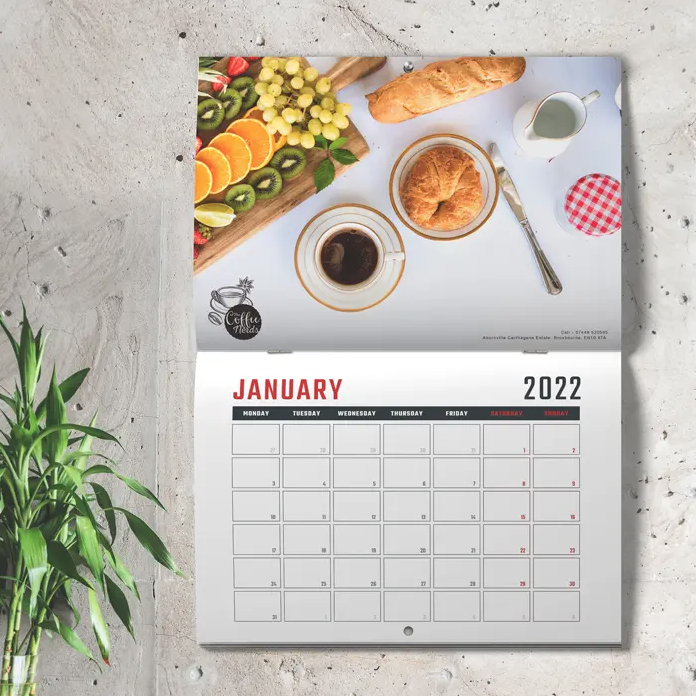
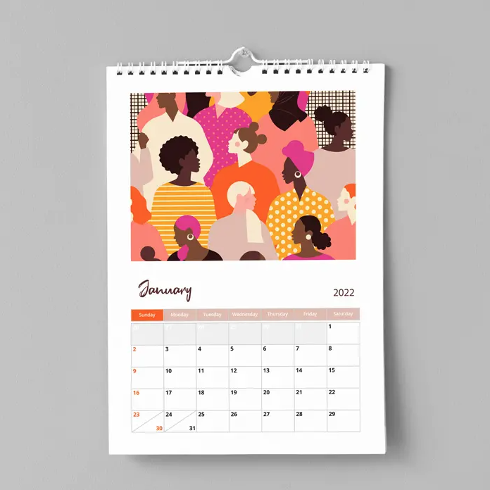
But please note, that this offer is only valid until 31st December 2021, so don’t miss out and get your quotation today! NOVEMBER 2021This month I’ll cover a couple of case studies, tell you how to get the best logo for your brand, give an update on paper prices, and get festive with a Christmas offer! 🎅🏻 Sound good? Let’s jump in… Case Study - Specialist Compliant Coatings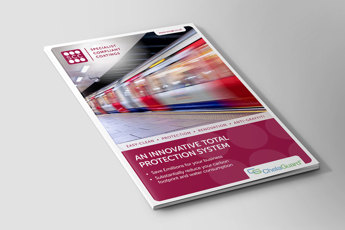 The Client: SCC needed a brochure designed as part of a pitch for a very important client. 👨🏻💼 What They Asked For: They needed it to be high-end and capture the attention of the reader effectively, telling their story and selling their product. 🤔 The reader in this case was the UK Department for Transport, and the pitch was for an innovative protection system for trains. Fair to say then - it needed to be the absolute best it could be. 🚆 What I Did: I got to work! I took the client’s brief and created something incredibly high-end for the proposal. It told a story about the savings associated with the product, why SCC are the best at what they do, and why the UK Department for Transport should use them. 👊 Let me know what you think! 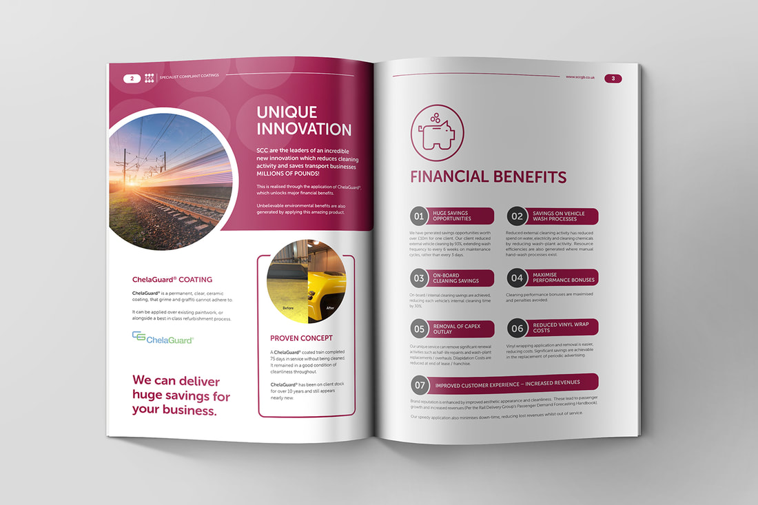 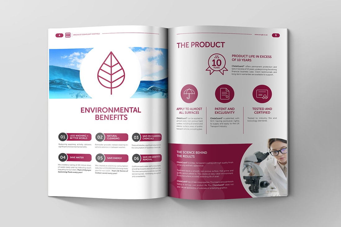 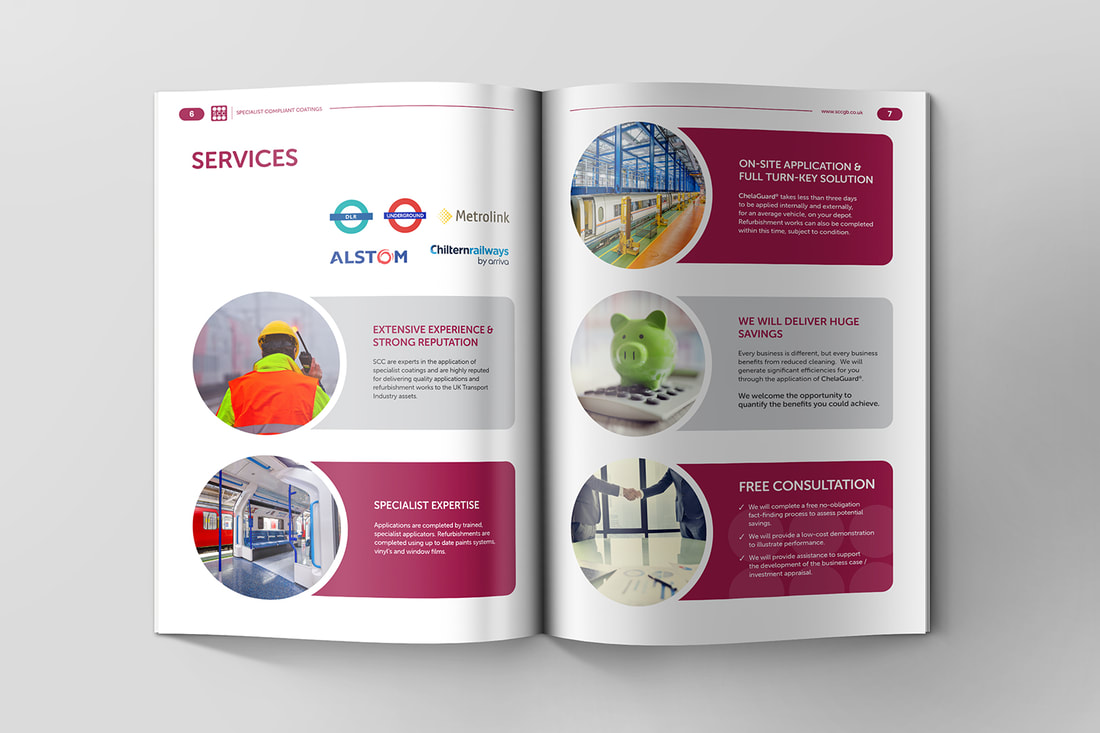 Get Festive and Save 20% with Get Noticed.Has Christmas caught you by surprise 😅? No need to panic - I’ve got you covered with fantastically festive branded Christmas cards and calendars for the new year! 🥳 Best of all, I’m offering a 20% discount on both of these festive items for this month only! 🤯 Just my way of thanking you for your business throughout what has been an incredibly difficult time for everyone. 🤗 You can choose between: 👇 Christmas Cards - Standard, luxury, and foil all available: 2022 Calendars – I’ve got it all from Tent Cards to Photo calendars, Desk Calendars, Wiro Bound Thumb Cut Calendars, Wiro Bound Drilled Calendars, Pocket Calendars, Wall Planners and Folded Wall Planners. All personalised with your brand logo, images and contact details Simply place your order before 30th November 2021 and receive 20% off. Offer only available to existing Get Noticed clients. FREE E-BOOK - How to get the Best Logo for your BrandLooking to get the best logo for your brand? Look no further! 👀 Because I’m such a charitable chap, I’ve actually created an e-book covering all you need to know about crafting the perfect logo for your business. 🤓 It encompasses everything you need to know, from the design process to colours, shapes, and lettering, as well as the essential design principles when it comes to logo design. And that’s just the tip of the iceberg! 🧊 Get yourself a free copy of my e-book right here. 👌 And if you want a professional to do it for you, simply fill in this short design brief to get your new logo design underway. Case Study - Yellow Mongoose GinTime for another case study! This time for a project with a bit more flavour… 😉 The Client: A local collaboration between Blue Mongoose Group and the Skelton-based Daisy Distillery. 🍸 What They Asked For: I was approached and tasked with creating a brand identity and bottle label design for their brand new Yellow Mongoose Christmas Mulled Gin. 🎄 A festive beverage but high-end nonetheless, I had to walk a fine line between fun and luxury. 🤔 Oh, and this was their first line of gins, so I had to get it right! 😅 What I Did: What I do best! I created something that hit the brief and exceeded the client’s expectations. 💪 I utilised a Christmassy colour palette, using a yellow logo for obvious reasons, and offsetting this with a deep green and white for that festive feeling. 🎄 Take a look below and let me know how I did! 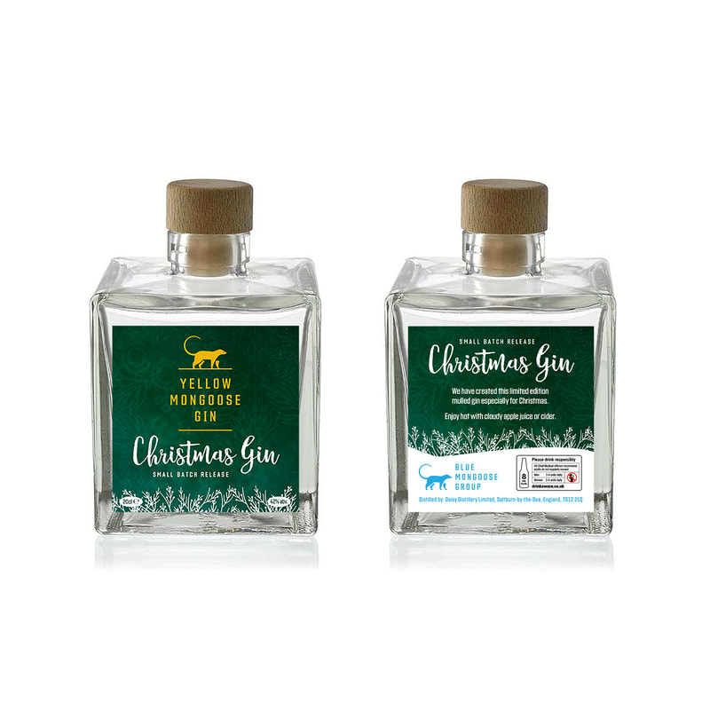 Paper Price UpdateAnd finally, a quick update on paper prices. Unfortunately, like many industries lately, costs are on the rise, including paper materials within my supply chain.
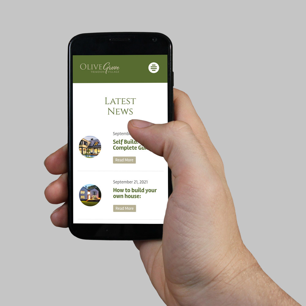
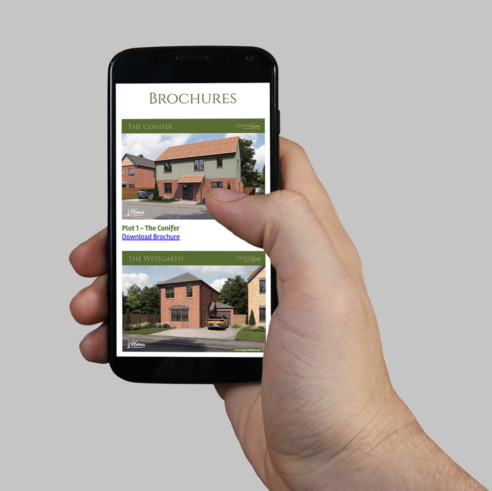
This means that all paper contracts increased on Monday 8th November by 15 to 20%. These increases are unprecedented and are impacting printers globally. It’s largely as a result of the increased costs, and shortages, within the energy sector. I’ve also been made aware that alarmingly, some paper suppliers are implementing force majeure and are cancelling all pre-agreed contact rates, putting even more pressure on an already challenging situation. I’m currently working through the impact these increases will have on your print prices, but I wanted to give you early notification that these challenges exist. Working with some of the biggest global printing businesses in the world, I have the benefit of access to some very robust supply chains. This means that I'm in a fortunate position in that we should not face any raw materials stock shortages. It is with regret that I am unable to absorb the full impact of these price increases and I have to take the difficult decision to pass on the increase to my clients. I know you’ll understand the fact that if I didn’t, I wouldn’t be able to continue to operate as a sustainable partner for your business. Thanks very much for understanding! OCTOBER 2021This month, we’ll look at some fantastic new case studies, how to get the best out of your website design, and how to make sure your brand identity truly represents your business. I’ll also introduce a brand new promotional product. Let’s start with a piece of work carried out for a new housing development in Country Durham... Case Study - Website Design for Olive Grove, Trimdon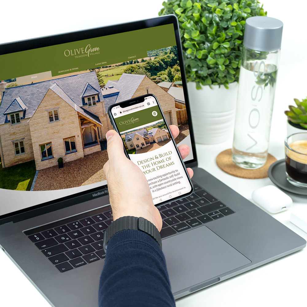 The Client: Olive Grove – a brand new housing development in the heart of Co. Durham. What They Asked For: I designed the umbrella website for Homes by Trafalgar, so they came to me when they needed help advertising their new development in Trimdon, Co. Durham. The client needed a project-specific website that looked the part, performed powerfully across devices, and displayed a range of information and imagery of the development. This would include site plans and available plots to promote the development and secure deposits from buyers. What I Did: I create a brochure-style website, built around the client’s specifications. It looked fantastic, worked across devices, and the design really embraced the brief, successfully illustrating Olive Grove’s collection of self-build and purpose-built homes in their fabulous, countryside setting. 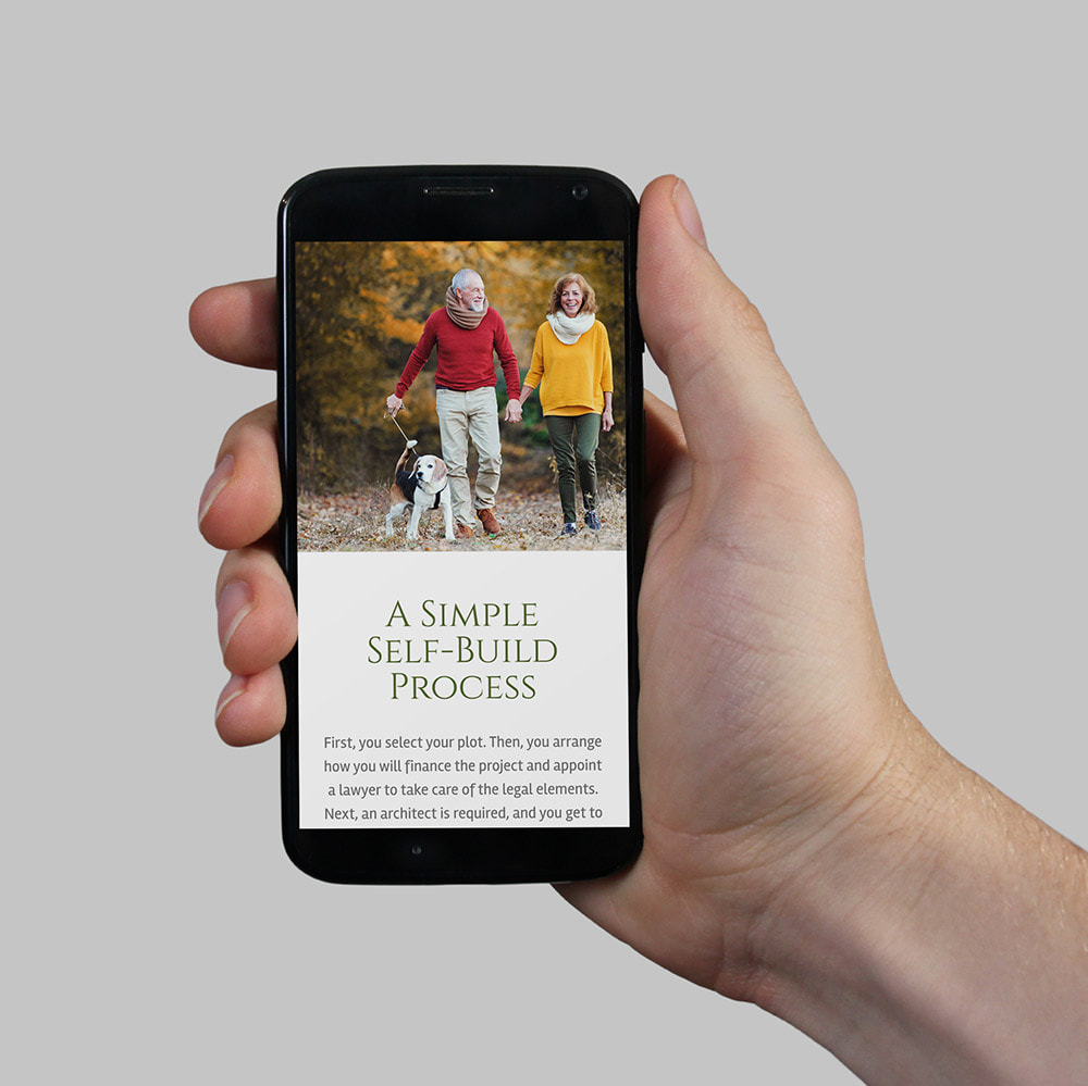 The site is easy to navigate and also shows off their plots, site plan, and everything else the client required. Dynamic content is a big trend for website design as we move into 2022, so this was incorporated as well other vital elements such as fast page load times, local SEO, and dynamic scrolling. 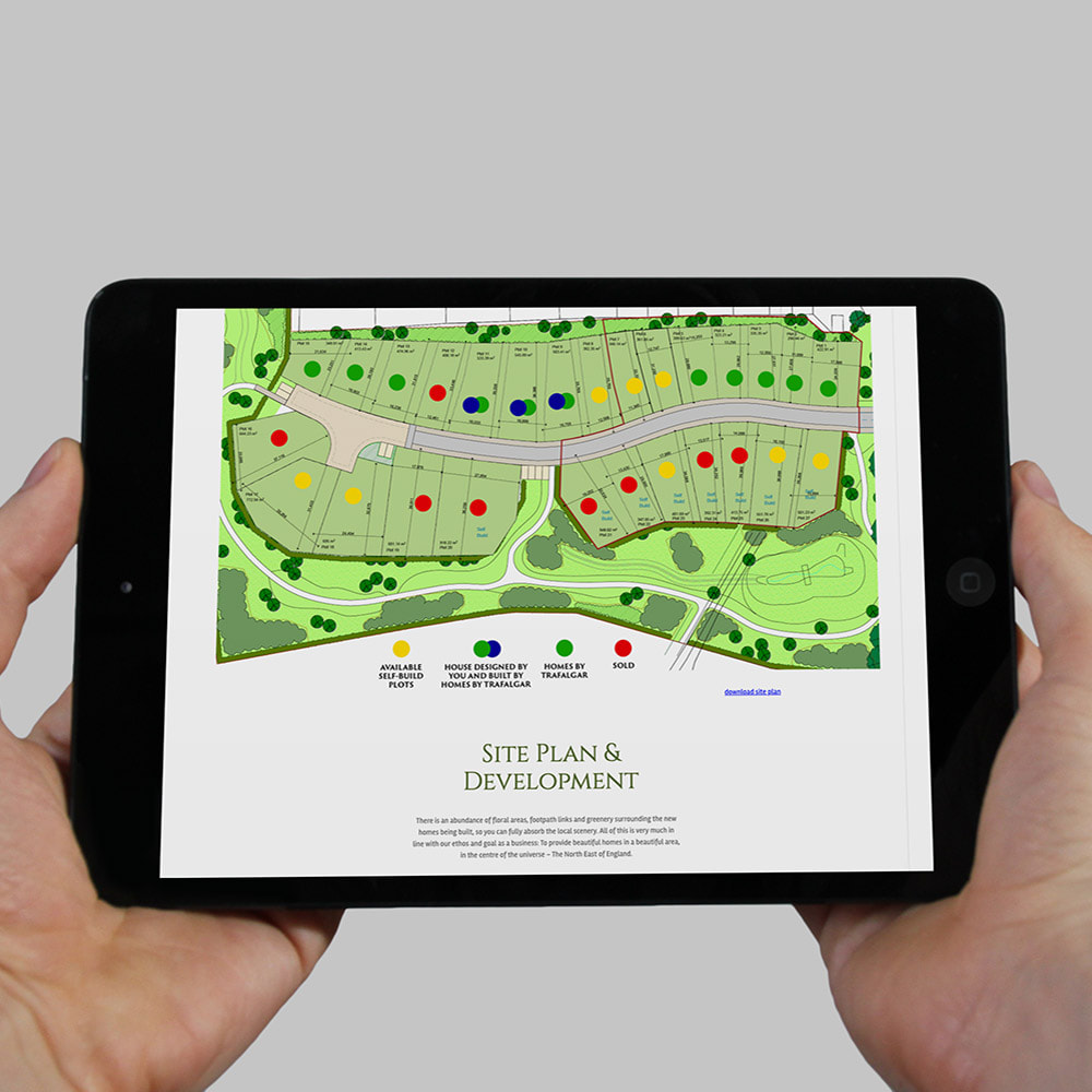 As with every site I design, the Olive Grove website was super-functional across devices and optimised for mobile, laptops, and tablets. Blog pages were also designed to post latest developments as well as a page on self-build financing. As you can see, the end-result of the project is a beautiful, high-end website design boasting stunning photography and maximum ease of use.
Take a look at the Olive Grove site to see it in action for yourself, and to see some more examples of web design from myself, browse the Get Noticed Website Packages today. How to Get The Most Out of Your Brand IdentityYour brand identity is how you present your business to the world. It needs to stick in customer’s minds and explain what it is you’re all about in a visually appealing way. But in lots of cases, small companies start out with a vague idea of brand identity but are much too focussed on getting their business up and running. This means they rush their branding with little thought or effort, and it’s also why so many business owners come to me in need of a re-think of their brand identity once they’re a little more established! And it’s not just smaller businesses who need this service, take Pringles, for example, who recently simplified their brand image and gave Mr. P. a haircut. 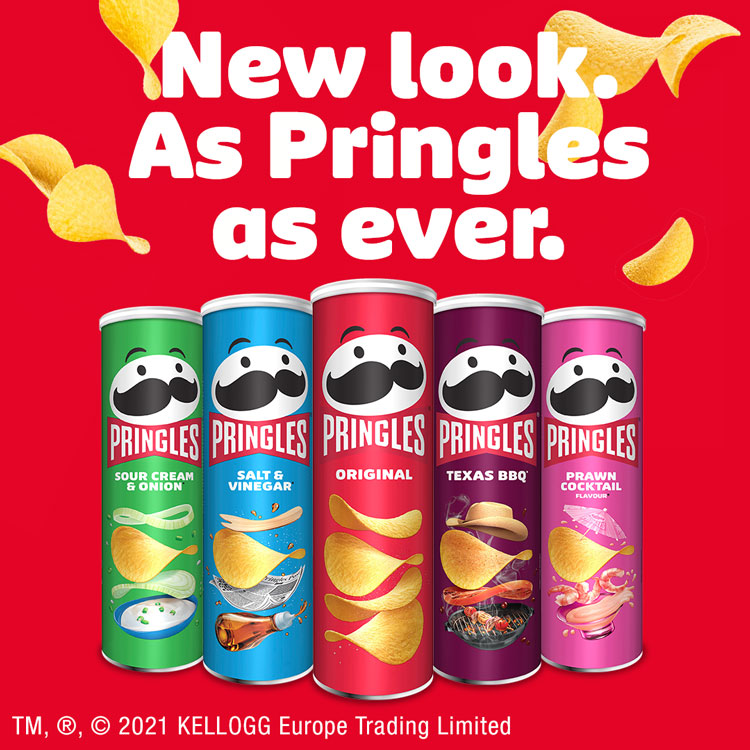 This is the first time they’ve changed their iconic brand identity in 20 years, so it’s never too late to reconsider your own. Especially as we embark on a new year with a whole heap of new design trends to look out for, from bold backgrounds to colourful icons and illustrations, inclusive visuals and more. The Pringles rebrand included packaging as well as iconography and logo design, and I can carry out similar work for you whether it’s for your website, business cards, leaflets, flyers, or physical packaging. Take a look at some of my brand identity work to see how I’ve transformed businesses around the UK, and reply to this email to get the ball rolling on your own project. Which brings us neatly on to my next case study… Case Study - Local Life Magazine Brand IdentityThe Client: Local Life Magazine, an independent bi-monthly A5 magazine for the local area. What They Asked For: Local Life Magazine came to me as a new client, and commissioned Get Noticed to create a brand new brand identity for their local magazine covering Acklam, Coulby Newham, Stainton, Nunthorpe, and Marton. What I Did: The main challenge for the magazine is to balance advertising and well written, generic editorial content, with a focus on providing both entertainment and helpful information. With this in mind, I created a brand identity which had a real modern and fresh feeling about it and showed the love of our local area... 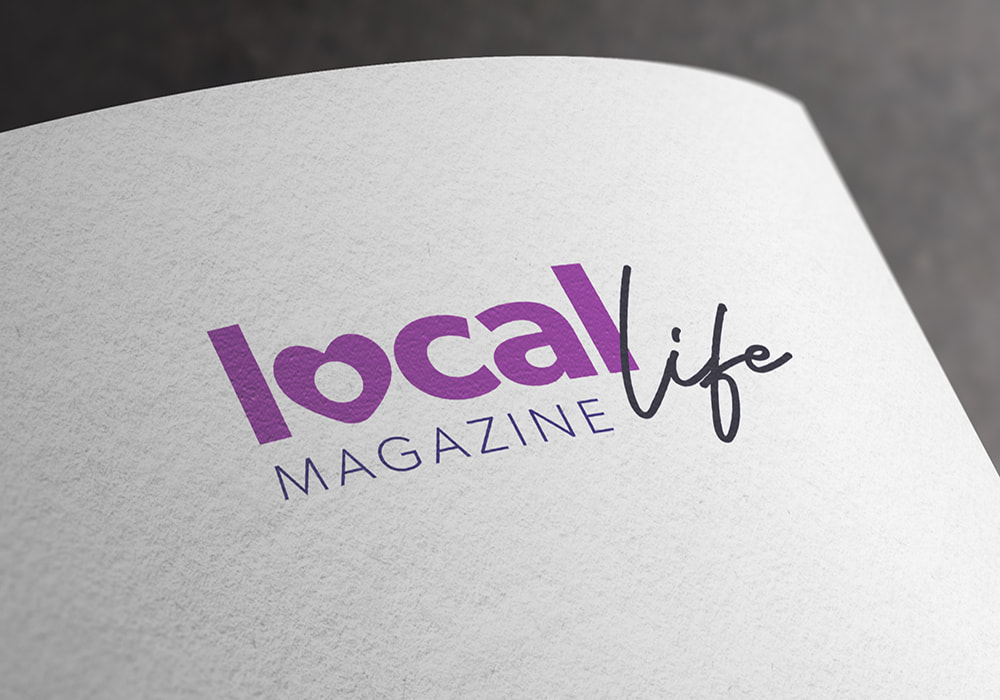 This identity is to be used for the magazine, applied to business cards, and even a website holding page. 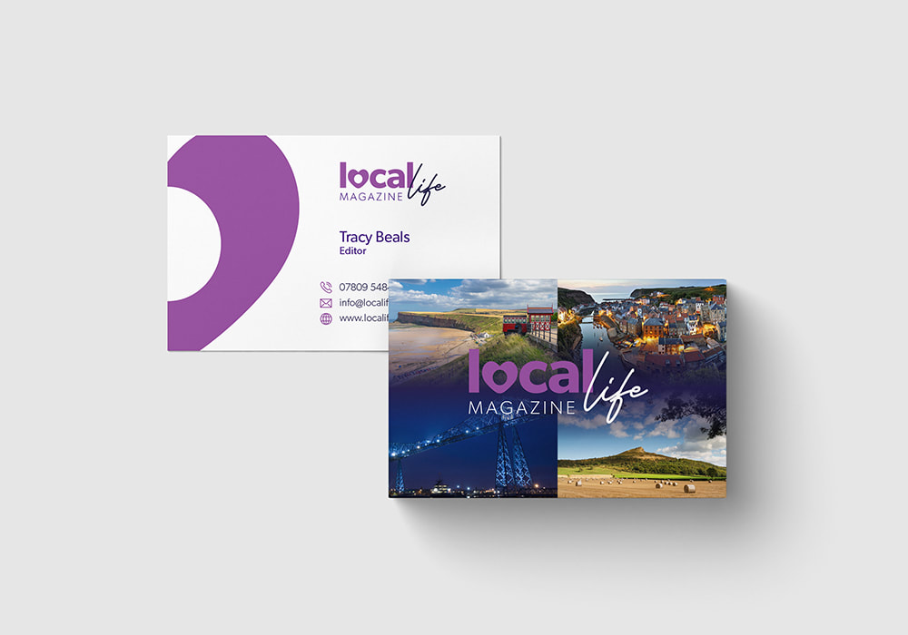 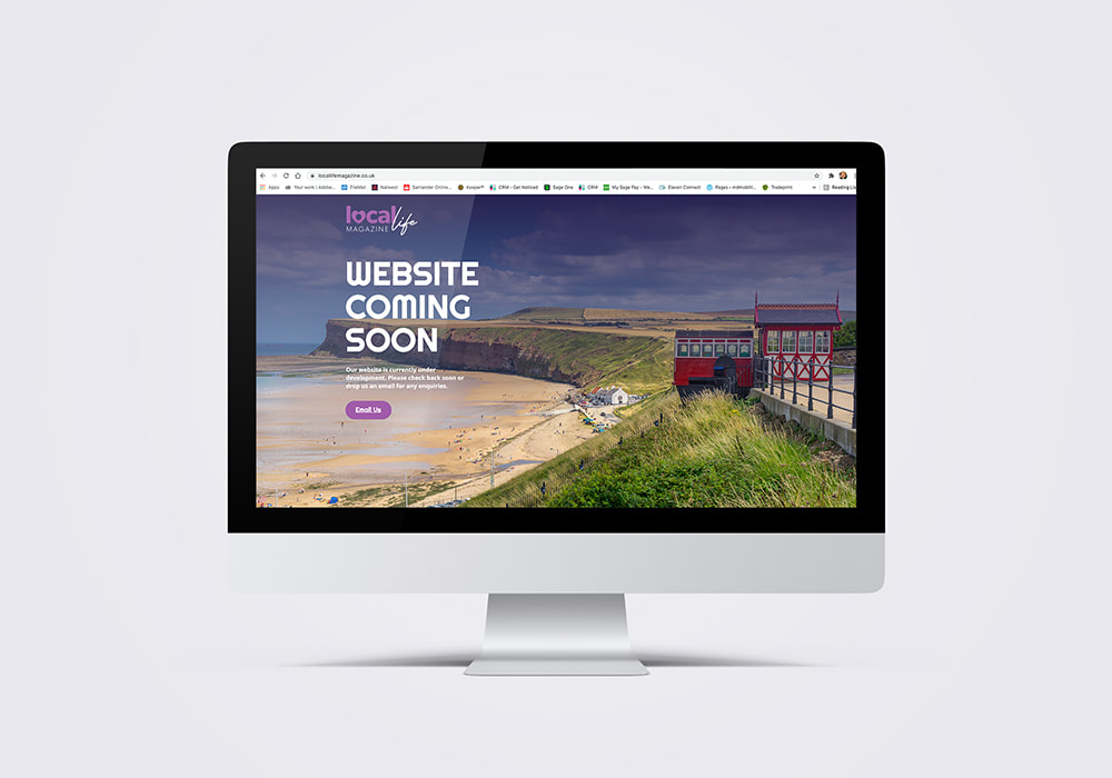 As you can see, the brand identity is easily transferred between different mediums, from business cards to the physical print magazine, not to mention the digital world in the form of their brand new holding page. You can view the Local Life Magazine holding page here, and if you’d like to find out more about the logo design packages I provide, please click here. New Product - Custom Printed Drinks Coasters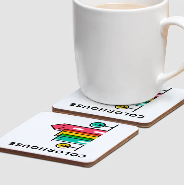 I think after the year and a half we’ve had, it’s fair to say that we could all use a drink.
And it’s not just a pint I’m talking about as we all know how much us Brits love a good brew! So, all of this makes it a no brainer to use coasters as a promotional item for your business, and what better way to make a coaster stand out than to brand them? Especially when you can do so with illustrations, logos, contact details and photos, all personalised in line with your brand identity. Sound good? Take a look at the deets below for all the info you need:
So, what are you waiting for? Contact me today to order yours. In this month’s Get Noticed Branding blog, I’ll be taking a look at one of the most effective and important techniques of marketing – outdoor advertising. There are many potential pitfalls when tackling outdoor branding yourself, so I’ve cobbled together my top 5 tips to make the most out of what can be an incredibly powerful promotion technique. So, let’s jump straight in with the tips! 1. A Good Call To Action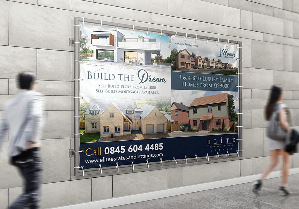 Absolutely vital for strong outdoor advertising is a good call to action. This is one of those graphic design tips that can be applied to various different brand awareness efforts, from website landing pages to brochure designs and everything in between. A good call to action is particularly important for outdoor advertising materials because there’s no point in grabbing somebody’s attention with beautiful design work, and that being the end of the matter. You need to not only hook them in, but send them in the right direction so you can convert their attention into sales or enquiries. Even a simple phone number, social media channel, or website will do the trick, you just need something to motivate a customer into action. 2. USE Legible Typefaces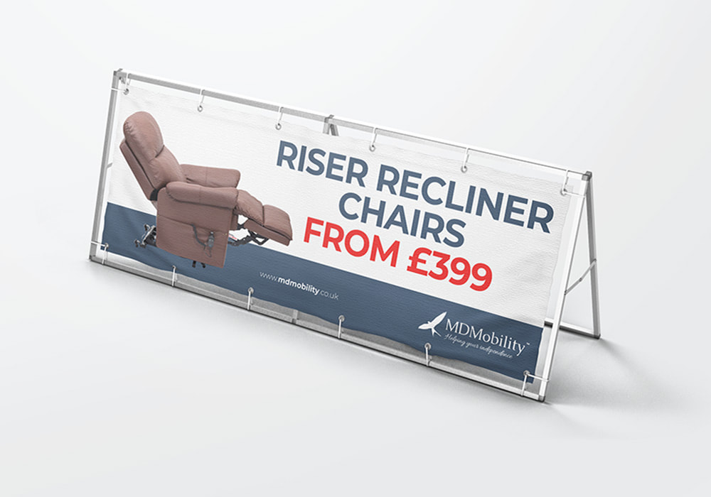 Another incredibly important top tip for outdoor advertising design is having readable, legible fonts.... or typefaces as designers call them. It sounds simple, but with outdoor advertising you’re wanting to get that instant reaction from potential customers. You can catch attention in a number of ways, but if people can’t read what you’re saying, it’s pretty pointless. So, don’t use complicated, fancy fonts or too many different fonts in your design, and make sure everything looks neat and tidy rather than cluttered. Keeps things correctly capitalised where possible (it’s easier on the eye from a psychological perspective), with block letters to attract people’s attention. Also increase letter size for emphasis or increased visibility. 3. LeSS IS MORE This is key with design in general and couldn’t be truer for outdoor advertising. Potential customers aren’t spending an age looking at your design in an outdoor setting, so you need to get to the point and do it quickly. Use the five second rule as a guide – If you can’t work out what it is you’re offering in five seconds, shorten your message. The trick is to make your message clear and concise and not too long, so that it can be absorbed rather than ignored at a glance. 4. USE COLOURS THAT WORK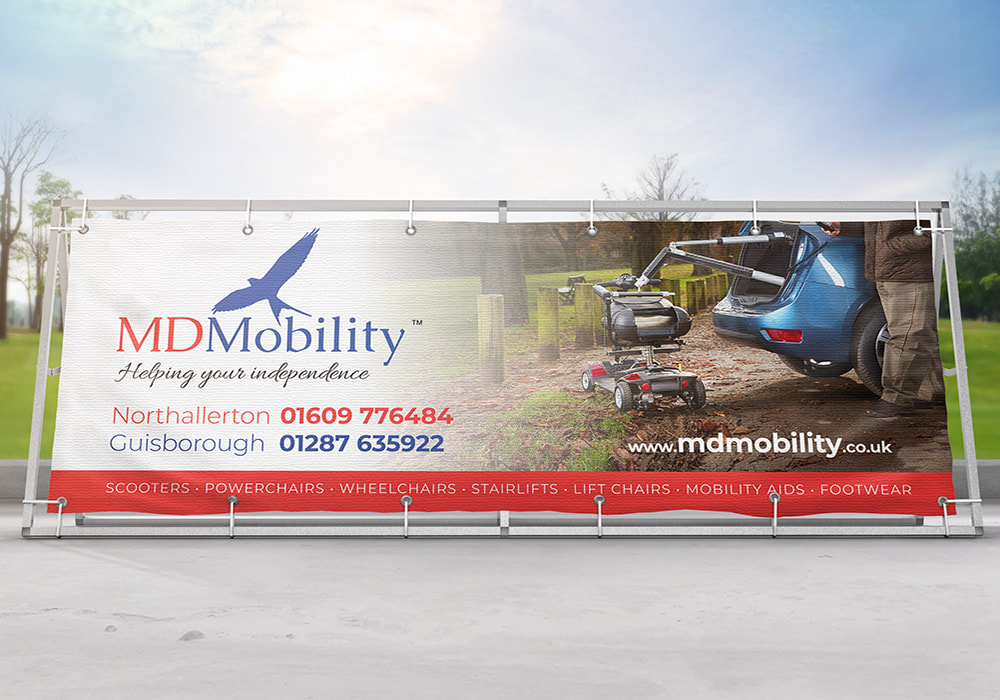 Colours are vital for outdoor advertising, so you need to get them right. Firstly, this means utilising contrast effectively with the foreground and background. Make sure the two elements don’t blend in to one, which makes the foreground difficult to read and the background too difficult to decipher. Bright and vibrant colours that complement each other are always a good idea, and will help you draw attention from a crowd of potential customers. But make sure the colours don’t clash or it could be a recipe for an outdoor advertising disaster. 5. IMAGERY And finally, imagery. Imagery is absolutely vital when it comes to outdoor advertising, because for the most part, the image is what catches people’s attention when they’re out and about, getting on with their everyday lives. Remember, a picture is worth a thousand words, so use the power of a simple and attractive image to your advantage. Make sure your imagery is clear and supports your marketing message, so you don’t distract from what it is you’re offering. Get in Touch with Get Noticed Branding
So, there you have it, my top 5 tips for effective outdoor advertising. I provide a massive range of outdoor advertising work right here at Get Noticed Branding, and can help you create something special for your event, product, or business. Take a look at the 2021 Get Noticed Print Catalogue for some inspiration, or drop me an email at [email protected] to find out more. |
 RSS Feed
Instrument House
Morgan Drive
Guisborough
North Yorkshire
TS14 7DH
Morgan Drive
Guisborough
North Yorkshire
TS14 7DH
Sign-up for updates...
|
|
